Problem
An outdated, clunky website was acting as a barrier between Greg Mier and his clients. It lacked modern functionality and failed to project the innovative nature of his law practice.
Solution
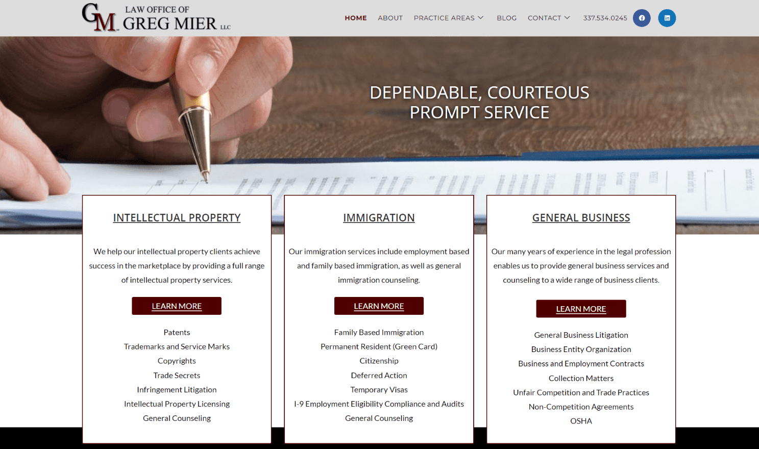
I built a streamlined, one-page digital headquarters. I utilized a modern grid system and floating UI elements to create a "scannable" experience. This new layout improved user engagement and simplified the client journey from "first impression" to "booked call."


Nitro feels alive. The floating cards and grid layout make every project pop without overcomplicating things. It’s clean, flexible, and modern.
Anonymous
Director of the Board